 Search
Sleek Dark Button
Page 1 of 1

Sleek Dark Button
![]() by 3loomi Wed Dec 15, 2010 2:58 am
by 3loomi Wed Dec 15, 2010 2:58 am
Sleek Dark Button
Step 1
First of all you’ll need to create a new Photoshop document – thesize I’ve chosen is 600 by 420 pixels just like all my other tutorials– but the button will be considerably smaller ;) With that open, fillit in with a dark radial gradient (I’ve used the colours #131313 and#090909).
Step 2
It seems to be quite popular to add noise to backgrounds so I’lljust quickly teach you how to achieve that effect: with your backgroundlayer selected go Filter > Noise > Add Noise with Amount 0.5%,Distribution Uniform and Monocrhomatic ticked. It isn’t too noticeableon this dark gradual gradient but with lighter colours, and moredistinct gradients, it would be more visible.
Step 3
Now it’s time to form the button: create a new layer and using therounded rectangle tool (radius set to 5 pixels, width: 250 pixels andheight: 40 pixels) create a rectangle in the center of the document.Any colour will do (I’ve used white so that it is easier to see).
Step 4
Next, we’re going to be applying a gradient overlay to our buttonusing layer styles. Go Layer > Layer Styles > Gradient Overlayand apply these settings:
This gives it a nice shiny look with a result of: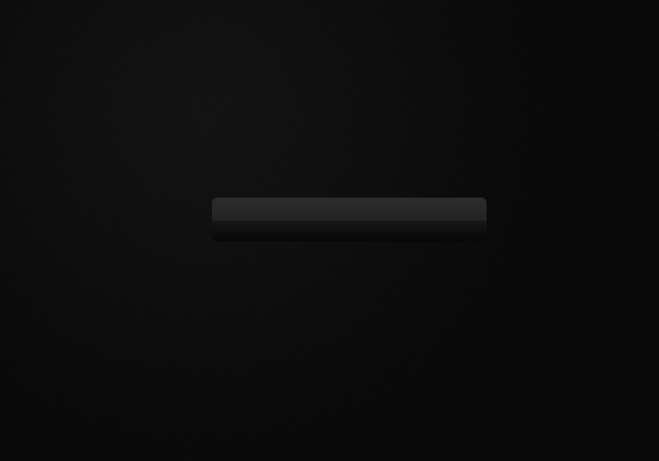
Step 5
The next step is to add the text for the button which can be done using the text tool.
Step 6
The next section of the button is the little icon beside the text:I’ve used a slightly different font style for the down arrow to makesure it is clearly defined. If you didn’t know how to make a doublearrow simply hold down the Alt key and type in the numbers 1, 7 then 5– it’s just an ascii symbol short key – and then rotate using transform(Edit > Transform > Rotate or Ctrl + T).
Step 7
Now we’ll just make the background for the down arrow icon: usingthat rounded rectangle tool we used before, make an 11 by 11 pixelssquare with a radius of 2 pixels. Again it doesn’t matter what colouryet, we’ll be changing that very shortly.
Step 8
Apply this gradient overlay to our new layer in the same way we did with the button.
Result:
Step 9
The button isn’t standing out very much, so to fix that we’ll add ahighlight underneath. To do this select the button layer’s area (ieCtrl + Click the button’s icon in the layers window) – we do thisbecause we want to have the same curvature of the button without toomuch effort.
Fill the selection with a reflected gradient with your foregroundcolour set to #95c622 and background #486e10. To do this: left click inthe center of the selection and drag to one of the sides and release(ie it will reflect from where you start the gradient). Keep theselection (as I have).
We only want the highlight to be a couple of pixels high (ie: a highlight) so nudge the selectionup two pixels by tapping the up arrow key (on your keyboard). You cannow deselect your selection (Ctrl + D). Now we want to move thehighlight below the button so nudge the layer down two pixels by tapping the down key while holding the Ctrl key.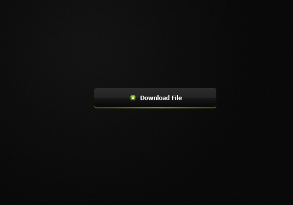
Step 10
So that’s the button complete, to add a hover effect in Photoshopsimply means that when your mouse is hovered above the button itchanges slightly so that it is obvious that the user can click it.Create a new layer above the base button layer (the shiny gradientlayer) and select the area of the button and apply a radial gradientfrom white (top) to transparent (bottom) in the selection.
To tone down the brightness set the blend mode of this layer to overlay and the opacity to 50%.
If you’d like to follow on with the coding of this button and create the rollover effect in CSS continue this tutorial here.

3loomi- الجنس :

عدد المساهمات : 826
النقاط : 52419
التقييم : 10
تاريخ التسجيل : 2010-09-01
» Glossy Button
» Simple Website Button
» Create dark wordpress theme
» درس دمج Create a Dark, Atmospheric Photo Manipulation
» Donload 8 Tileable Dark Wood Texture Patterns
» Simple Website Button
» Create dark wordpress theme
» درس دمج Create a Dark, Atmospheric Photo Manipulation
» Donload 8 Tileable Dark Wood Texture Patterns
Page 1 of 1
Permissions in this forum:
You cannot reply to topics in this forum|
|
|