 Home
Home Publications
Icon design for non-designers
Page 1 of 1

Icon design for non-designers
by discovery Fri Mar 18, 2011 12:30 am
Icon
design for non-designers
Icon
design for non-designers
 Quick question: what’s a good icon
for fidelity? For intelligence? Taxes? Change?
My quick answer: There isn’t one…so you shouldn’t try too hard to
make one.
A picture is worth a thousand words…unless it’s an icon
If it’s an icon, then it’s worth up to three words—at best!
The oft-cited cliché is very misleading because icons are a very poor
way to communicate. With the exception of well known standard icons,
people understand text labels much faster than icons.
The ribbon
UI, introduced by Microsoft Office 12, is much easier to understand
and use than traditional toolbars primarily because it takes extra
space to give nearly every command an explicit label. (The
exceptions in Word: Fonts, Paragraph, Quick launch are unlabeled.)
Office also uses many preview-based graphics (such as Styles that
preview the effect of the style), but those are really thumbnails not
icons.
Take the icon challenge
Don’t believe that icons are a poor way to communicate? Take the
“icon challenge” by removing all command labels and seeing if you can
correctly determine what the commands do based on the icon alone. For
example, try to figure out the labels for the Insert tab in Word:

When I tried this, I scored only 10 out of 24 for this ribbon tab.
Keep in mind that Word is a familiar program and Office uses excellent
iconography, so I would expect the typical score to be even lower.
BTW: I recommended using this approach to evaluate your product’s
icons.
Recognition vs. comprehension
If icons are so poor at communicating, why bother with them? First, I
should reiterate that well known standard icons communicate their 1 – 3
words quite effectively. It’s the not well known, non-standard
icons—the ones that require time and thought to figure out—that are the
ones in question.
Such icons have value not because they communicate their purpose
well, but because they help users recognize and distinguish
commands visually. It’s all about efficient visual recognition. So
while users understand text labels quickly, they can recognize and
distinguish between icons faster still. For example, users might
remember that the command they are looking for has a globe on it and
locate it immediately, even though they might not know what the globe
means. When there are many commands (as on a typical ribbon), the icon +
label combination works well because the icon enables quick visual
recognition and the text label enables quick comprehension.
Efficient recognition is extremely valuable—just keep in mind that
it’s no substitute for comprehension. If your target user’s
comprehension of your icons is low, it’s likely that you need to
reconsider your labeling strategy more than the icon design itself.
Icon design types
The user’s ability to understand an icon is primarily determined by
the icon type. The follow icon types are usually easy to understand:
Standard and simple works well. This list reveals an interesting
challenge to icon design: Icons are pictures, and pictures show nouns.
Yet, icons are used to represent commands, and commands are usually
verbs. Consequently, most icons boil down to a noun representing
or doing the verb.
The following icon types are moderately difficult to understand:
Metonyms and synecdoche are related to metaphors, but I
listed them explicitly because, contrary to popular belief, metaphors
aren’t the only game in town. Using a fork on a map to
represent a restaurant is a synecdoche, not a metaphor. Again,
simplicity and familiarity is the key to success here. For example, a
star is a successful metonym for “favorite” because people often rate
things they like using stars.
The following icon types are difficult to understand:
Going back to my original question, “fidelity” is an abstract
concept, so it’s very difficult (I would argue, impossible) to create an
understandable icon to represent it. One could try: Dogs are known for
having fidelity to their masters, but a dog icon is far more likely to
be interpreted literally.
In addition to type, context plays an important role by allowing
users to easily deduce meaning. For example, a zebra icon (an unfamiliar
noun, icon-wise) is meaningless out of context, but in the context of
monkey, turtle, bird, and snake icons, a zebra most likely represents
savanna animals.
Everett’s Laws of Icon Design
I have a couple laws for icon design:
The longer it takes to come up with an
idea for an icon, the less comprehensible the icon is going to be.
And
If an icon requires a tooltip to
understand, it’s not comprehensible. At best, using it helps
recognition.
If you’re wracking your brain trying to come up with an idea
for a good icon, most likely it’s because there isn’t one. Once
you’ve made this realization (and you really must have an icon), better
to focus on the recognition consolation prize.
What to do if your icons aren’t good
Consider the following, in priority order:
Use preexisting icons consistently with their meaning
Given the challenge and expense of creating meaningful icons, it’s
important to reuse icons whenever appropriate (as opposed to creating
new ones). To reinforce their meaning (instead of diluting it),
choose preexisting icons based on their meaning, not their appearance.
If a design detail has a different meaning, use another design. So,
use scissors to mean Cut, not Office supplies; use binoculars to mean
Find, not Zoom; use a gleam overlay to mean New, not Glossy.
To show how inconsistent reuse can dilute meaning, consider the ‘x’
overlay. Currently, there’s no consistency at all, either in terms of
meaning (does it mean delete, error, cancel, close, exit, stop, clear,
disconnected, or not available?) or presentation (red, black, or while;
normal vs. script; alone vs. within a circle). Consequently, you can’t
be sure of its meaning based on the design alone—all you know is that
the overlay indicates a state that isn’t positive. (BTW: The design
community should fix this: Delete should always be a black, script x
(never red!); Error should always be a red, normal x; etc.)
Bottom line: To preserve meaning, these design details aren’t
arbitrary choices.
If
you do only one thing:
Reconsider the need for icons. While icons are helpful for comprehension
and recognition, users’ ability to comprehend icons is vastly
overrated. Consequently, prefer icons that are standard, simple, and
familiar. With the exception of well-known, standard icons, label all
icons either in-place or with a tooltip. If you really need custom
icons, use an icon design specialist.
Are you sure? How to write effective
confirmations
 I stumbled upon Never Use a
Warning When you Mean Undo by Aza Raskin the other day (and to
clarify, what Aza calls a warning, I call a confirmation
where users are explicitly asked to proceed with a task they
initiated.) Aza’s basic point is that confirmations are often used when
an undo feature would be more appropriate. While true, this isn’t always
the best solution (even if Undo were always possible), and what’s more,
this is only part of the story. In this post, I’ll tell the whole
story.
UI is communication
When making a design decision, it’s good to think about alternative
designs as Aza suggests here. However, a more fundamental design
principle to consider first is the need for effective communication. A
user interface is a conversation between the user and your product’s
underlying technology. A UI is good only if that communication feels
natural, friendly, and efficient. Effective communication is
the universal design principle that spans the popular UI design books,
from Don Norman’s The Design of Everyday Things, to Steve
Krug’s Don’t Make Me Think, to Edward Tufte’s books on visual
communication. Effective communication is essential to the design of all
UI elements, including task flow, text, use of controls, layout,
animation, color—even icons and graphics.
What do confirmations communicate?
Imagine a situation where everything you did was confirmed based on
the possibility—however small—that you might not intend to proceed with
what you were doing. Some UIs feel like this, so you don’t have to
imagine too hard. In this situation, you quickly become habituated to
the extra step and proceed without giving the confirmation any thought.
Not only would such confirmations not achieve their intended goal of
reducing error, but they actually increase error because any
necessary confirmations would no longer stand out. Confirming would be a
pointless ritual, much like the “Final answer” routine in Who Wants
to Be a Millionaire.
So what makes a confirmation necessary? The mere possibility
of making a mistake isn’t sufficient. There are three basic
patterns where confirmations are warranted:
Given these basic patterns, a confirmation is necessary when
there is a strong reason not to proceed. An effective
confirmation is essentially trying to talk the user out of proceeding
and there is a significant chance that the user might decide not to.
Another important implication: confirmations should be rarely
needed—a well designed system shouldn’t have many actions that
are risky or have unintended consequences.
Are you sure?
Confirmations tend to be abused because they are easy to implement.
They also provide an element of safety—for the designer—because they
transfer the liability of a mistake from the software to the user (the
logic: we asked you and you said “yes,” so if you aren’t happy it’s your
fault.)
But neither of these are a good reason to use a confirmation and
often there is a better alternative:

The answer is never No, so don’t
bother asking.
I could give many more examples for each of these alternatives, but
the bottom line is that it should be difficult to lose work or
make significant mistakes in a well designed product. When
evaluating a task flow, at each step ask yourself “What mistakes might
the user make and how does the design prevent them or reduce their
impact?”
Main instructions
A good confirmation main instruction must require thought.
Remember, the entire point of an effective confirmation is to give the
user a reason not to proceed, so that reason should be clear. (Making
the generic “Are you sure?” confirmation clearly pointless.) The risk of
the action or the unintended consequence should be extremely clear.
Provide all the information
A general rule: whenever you ask the user a question, you
provide all the information required to provide an informed answer.
Be sure to give specific risks, object names, contexts, etc. required
to respond in the confirmation itself.
Design responses to create a mental speed bump
Ordinarily, a good dialog box is designed for efficient decision
making, where users can often respond without reading anything but the
response buttons.
While this works well in general, the entire point of a
confirmation is to get the user to stop and think about whether or not
to proceed. (If proceeding requires no thought, don’t confirm!)
There are two facts about user behavior that we need to work with here:
Given these facts, there are three ways we can write the response
button labels to create a mental speed bump:
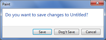
The Save vs. Don’t save labels tell
you everything you need to know.
Don’t annoy me again
I forgot to mention the top problem with unnecessary
confirmations—they’re annoying! When users are frustrated by unnecessary
confirmations, all too often the “solution” is to add a “Don’t show
this message again” option. Adding this option is a clear sign that the
confirmation is unnecessary, because it makes no sense to add this
option for a necessary confirmation.
While this is better than always confirming, it’s worse than never
asking or asking just once. So while many people like this option, I
don’t. All it does is show me that the designer tried to weasel out of
making the hard design decision. (To be clear: sometimes using this
option is a good idea, but those situations are fairly rare.)
If
you do only one thing:
Present a confirmation only if there is a solid reason to not proceed.
If there is a reason to not proceed, make that reason obvious, provide
all the information required to make a good decision, and design the
response buttons to encourage users to read the main instruction. If a
confirmation isn’t necessary, do the right thing and remove it.
design for non-designers
Icon
design for non-designers
Quick question: what’s a good icon for fidelity? For intelligence? Taxes? Change?
My quick answer: There isn’t one…so you shouldn’t try too hard to
make one.
A picture is worth a thousand words…unless it’s an icon
If it’s an icon, then it’s worth up to three words—at best!
The oft-cited cliché is very misleading because icons are a very poor
way to communicate. With the exception of well known standard icons,
people understand text labels much faster than icons.
The ribbon
UI, introduced by Microsoft Office 12, is much easier to understand
and use than traditional toolbars primarily because it takes extra
space to give nearly every command an explicit label. (The
exceptions in Word: Fonts, Paragraph, Quick launch are unlabeled.)
Office also uses many preview-based graphics (such as Styles that
preview the effect of the style), but those are really thumbnails not
icons.
Take the icon challenge
Don’t believe that icons are a poor way to communicate? Take the
“icon challenge” by removing all command labels and seeing if you can
correctly determine what the commands do based on the icon alone. For
example, try to figure out the labels for the Insert tab in Word:
When I tried this, I scored only 10 out of 24 for this ribbon tab.
Keep in mind that Word is a familiar program and Office uses excellent
iconography, so I would expect the typical score to be even lower.
BTW: I recommended using this approach to evaluate your product’s
icons.
Recognition vs. comprehension
If icons are so poor at communicating, why bother with them? First, I
should reiterate that well known standard icons communicate their 1 – 3
words quite effectively. It’s the not well known, non-standard
icons—the ones that require time and thought to figure out—that are the
ones in question.
Such icons have value not because they communicate their purpose
well, but because they help users recognize and distinguish
commands visually. It’s all about efficient visual recognition. So
while users understand text labels quickly, they can recognize and
distinguish between icons faster still. For example, users might
remember that the command they are looking for has a globe on it and
locate it immediately, even though they might not know what the globe
means. When there are many commands (as on a typical ribbon), the icon +
label combination works well because the icon enables quick visual
recognition and the text label enables quick comprehension.
Efficient recognition is extremely valuable—just keep in mind that
it’s no substitute for comprehension. If your target user’s
comprehension of your icons is low, it’s likely that you need to
reconsider your labeling strategy more than the icon design itself.
Icon design types
The user’s ability to understand an icon is primarily determined by
the icon type. The follow icon types are usually easy to understand:
- Standard symbols.
- Preview of results.
- Simple nouns.
- Simple nouns doing simple verbs.
- Simple nouns showing simple adjectives.
- Well known logos.
- All of the above with a single standard overlay (error, warning,
disabled, blocked).
Standard and simple works well. This list reveals an interesting
challenge to icon design: Icons are pictures, and pictures show nouns.
Yet, icons are used to represent commands, and commands are usually
verbs. Consequently, most icons boil down to a noun representing
or doing the verb.
The following icon types are moderately difficult to understand:
- Metaphors
When an object with similar behaviors or properties is used as a
substitute. - Metonyms
When a completely different but related object is used as a substitute. - Synecdoche
When a part represents the whole.
Metonyms and synecdoche are related to metaphors, but I
listed them explicitly because, contrary to popular belief, metaphors
aren’t the only game in town. Using a fork on a map to
represent a restaurant is a synecdoche, not a metaphor. Again,
simplicity and familiarity is the key to success here. For example, a
star is a successful metonym for “favorite” because people often rate
things they like using stars.
The following icon types are difficult to understand:
- Unfamiliar nouns.
- Complex, detailed icons.
- Abstract concepts.
- Multiple overlays.
- Puns.
Going back to my original question, “fidelity” is an abstract
concept, so it’s very difficult (I would argue, impossible) to create an
understandable icon to represent it. One could try: Dogs are known for
having fidelity to their masters, but a dog icon is far more likely to
be interpreted literally.
In addition to type, context plays an important role by allowing
users to easily deduce meaning. For example, a zebra icon (an unfamiliar
noun, icon-wise) is meaningless out of context, but in the context of
monkey, turtle, bird, and snake icons, a zebra most likely represents
savanna animals.
Everett’s Laws of Icon Design
I have a couple laws for icon design:
The longer it takes to come up with an
idea for an icon, the less comprehensible the icon is going to be.
And
If an icon requires a tooltip to
understand, it’s not comprehensible. At best, using it helps
recognition.
If you’re wracking your brain trying to come up with an idea
for a good icon, most likely it’s because there isn’t one. Once
you’ve made this realization (and you really must have an icon), better
to focus on the recognition consolation prize.
What to do if your icons aren’t good
Consider the following, in priority order:
- Reconsider the need. Simply put, icons are
overrated and are rarely required. Text labels work just fine when there
are only a few commands, and icons help recognition when there are
many. But when they aren’t really needed, icons just add visual clutter.
You can design a great experience without them. Check out modern
web-based apps like FreshBooks
and Wufoo, which use
few icons and aren’t missing anything. - Reconsider consistency. Using icons somewhere
doesn’t mean that you have to use them everywhere. Note how Outlook only
uses the well known standard icons in the File menu.
Not only does that eliminate the need for icons with low comprehension,
it makes the frequently used icons stand out. - Hire an icon design specialist. Icon design is a
specialized talent, so you’ll need to hire a specialist to design
professional, comprehensible icons. Keep in mind that creating custom
icons is very time intensive, so don’t expect to get off cheap. (And
whatever you do, don’t attempt to design them yourself.)
Use preexisting icons consistently with their meaning
Given the challenge and expense of creating meaningful icons, it’s
important to reuse icons whenever appropriate (as opposed to creating
new ones). To reinforce their meaning (instead of diluting it),
choose preexisting icons based on their meaning, not their appearance.
If a design detail has a different meaning, use another design. So,
use scissors to mean Cut, not Office supplies; use binoculars to mean
Find, not Zoom; use a gleam overlay to mean New, not Glossy.
To show how inconsistent reuse can dilute meaning, consider the ‘x’
overlay. Currently, there’s no consistency at all, either in terms of
meaning (does it mean delete, error, cancel, close, exit, stop, clear,
disconnected, or not available?) or presentation (red, black, or while;
normal vs. script; alone vs. within a circle). Consequently, you can’t
be sure of its meaning based on the design alone—all you know is that
the overlay indicates a state that isn’t positive. (BTW: The design
community should fix this: Delete should always be a black, script x
(never red!); Error should always be a red, normal x; etc.)
Bottom line: To preserve meaning, these design details aren’t
arbitrary choices.
If
you do only one thing:
Reconsider the need for icons. While icons are helpful for comprehension
and recognition, users’ ability to comprehend icons is vastly
overrated. Consequently, prefer icons that are standard, simple, and
familiar. With the exception of well-known, standard icons, label all
icons either in-place or with a tooltip. If you really need custom
icons, use an icon design specialist.
Are you sure? How to write effective
confirmations
I stumbled upon Never Use a Warning When you Mean Undo by Aza Raskin the other day (and to
clarify, what Aza calls a warning, I call a confirmation
where users are explicitly asked to proceed with a task they
initiated.) Aza’s basic point is that confirmations are often used when
an undo feature would be more appropriate. While true, this isn’t always
the best solution (even if Undo were always possible), and what’s more,
this is only part of the story. In this post, I’ll tell the whole
story.
UI is communication
When making a design decision, it’s good to think about alternative
designs as Aza suggests here. However, a more fundamental design
principle to consider first is the need for effective communication. A
user interface is a conversation between the user and your product’s
underlying technology. A UI is good only if that communication feels
natural, friendly, and efficient. Effective communication is
the universal design principle that spans the popular UI design books,
from Don Norman’s The Design of Everyday Things, to Steve
Krug’s Don’t Make Me Think, to Edward Tufte’s books on visual
communication. Effective communication is essential to the design of all
UI elements, including task flow, text, use of controls, layout,
animation, color—even icons and graphics.
What do confirmations communicate?
Imagine a situation where everything you did was confirmed based on
the possibility—however small—that you might not intend to proceed with
what you were doing. Some UIs feel like this, so you don’t have to
imagine too hard. In this situation, you quickly become habituated to
the extra step and proceed without giving the confirmation any thought.
Not only would such confirmations not achieve their intended goal of
reducing error, but they actually increase error because any
necessary confirmations would no longer stand out. Confirming would be a
pointless ritual, much like the “Final answer” routine in Who Wants
to Be a Millionaire.
So what makes a confirmation necessary? The mere possibility
of making a mistake isn’t sufficient. There are three basic
patterns where confirmations are warranted:
- Risky actions The user is about to take an action
that has significant consequences that cannot be easily undone. - Unintended consequence The action itself might not
be risky, but there is a significant side effect of the action that the
user needs to be aware of. - Clarification There is more than one way to perform
the action, so the user needs to confirm the desired outcome. These are
usually presented as a choice dialog, but they have the effect of being
a confirmation as well, particularly if the user doesn’t desire any of
the offered outcomes.
Given these basic patterns, a confirmation is necessary when
there is a strong reason not to proceed. An effective
confirmation is essentially trying to talk the user out of proceeding
and there is a significant chance that the user might decide not to.
Another important implication: confirmations should be rarely
needed—a well designed system shouldn’t have many actions that
are risky or have unintended consequences.
Are you sure?
Confirmations tend to be abused because they are easy to implement.
They also provide an element of safety—for the designer—because they
transfer the liability of a mistake from the software to the user (the
logic: we asked you and you said “yes,” so if you aren’t happy it’s your
fault.)
But neither of these are a good reason to use a confirmation and
often there is a better alternative:
- Prevent the error You don’t need to confirm if you
can prevent a mistake from happening in the first place. For example, if
you design your system architecture to avoid unintended consequences,
there’s no need for its confirmation. Another approach is to design
direct manipulations to avoid accidental
manipulation. - Provide feedback Good feedback is a good way to
prevent errors, especially with direct manipulation. Users shouldn’t be
able to make significant mistakes without knowing it. For example, you
don’t need to confirm direct manipulations if their effect is extremely
clear. - Provide undo Provide the ability to easily revert
unintended actions. For example, having a trash can, recycle bin, or
deleted items folder is a standard way to restored accidentally deleted
objects. User-created objects should be restorable from their deleted
state for an extended period of time—modern UXs shouldn’t delete them
until necessary. - Make the results easy to change Suppose you have a
situation where there might be two intended outcomes, but one outcome is
98% likely and the other is just 2%. You can eliminate the
Clarification confirmation by doing the 98% choice automatically,
especially if you make it easy for users to chose the 2% option later. - Just don’t ask If the confirmation isn’t necessary
and none of the above alternatives work, usually the best solution is to
just not ask.
The answer is never No, so don’t
bother asking.
I could give many more examples for each of these alternatives, but
the bottom line is that it should be difficult to lose work or
make significant mistakes in a well designed product. When
evaluating a task flow, at each step ask yourself “What mistakes might
the user make and how does the design prevent them or reduce their
impact?”
Main instructions
A good confirmation main instruction must require thought.
Remember, the entire point of an effective confirmation is to give the
user a reason not to proceed, so that reason should be clear. (Making
the generic “Are you sure?” confirmation clearly pointless.) The risk of
the action or the unintended consequence should be extremely clear.
Provide all the information
A general rule: whenever you ask the user a question, you
provide all the information required to provide an informed answer.
Be sure to give specific risks, object names, contexts, etc. required
to respond in the confirmation itself.
Design responses to create a mental speed bump
Ordinarily, a good dialog box is designed for efficient decision
making, where users can often respond without reading anything but the
response buttons.
While this works well in general, the entire point of a
confirmation is to get the user to stop and think about whether or not
to proceed. (If proceeding requires no thought, don’t confirm!)
There are two facts about user behavior that we need to work with here:
- We can’t force users to read the main instruction.
- Users do read button labels before they click them.
Given these facts, there are three ways we can write the response
button labels to create a mental speed bump:
- Choose specific responses so that the reason to not proceed is
obvious even without reading the main instruction.
The Save vs. Don’t save labels tell
you everything you need to know.
- Use Yes/No responses (with the safe response the default). While
there’s no guarantee, users generally read what they are responding Yes
or No to before clicking. - Add “anyway” to the label, as in “Proceed anyway.” Anyway is a very
provocative word that gets users to stop and think. “You mean there’s a
reason to not proceed? Better find out what it is first.”
Don’t annoy me again
I forgot to mention the top problem with unnecessary
confirmations—they’re annoying! When users are frustrated by unnecessary
confirmations, all too often the “solution” is to add a “Don’t show
this message again” option. Adding this option is a clear sign that the
confirmation is unnecessary, because it makes no sense to add this
option for a necessary confirmation.
While this is better than always confirming, it’s worse than never
asking or asking just once. So while many people like this option, I
don’t. All it does is show me that the designer tried to weasel out of
making the hard design decision. (To be clear: sometimes using this
option is a good idea, but those situations are fairly rare.)
If
you do only one thing:
Present a confirmation only if there is a solid reason to not proceed.
If there is a reason to not proceed, make that reason obvious, provide
all the information required to make a good decision, and design the
response buttons to encourage users to read the main instruction. If a
confirmation isn’t necessary, do the right thing and remove it.

discovery- الجنس :

عدد المساهمات : 1005
النقاط : 54312
التقييم : 12
تاريخ التسجيل : 2010-04-28
Similar topics» Designers A to Z
» Top 10 American Fashion Designers
» 5 Advanced Photoshop Techniques for Web Designers
» Icon Packs
» 31 Free Photoshop Layer Styles for Designers
» Top 10 American Fashion Designers
» 5 Advanced Photoshop Techniques for Web Designers
» Icon Packs
» 31 Free Photoshop Layer Styles for Designers
Page 1 of 1
Permissions in this forum:
You cannot reply to topics in this forum|
|
|