 Search
Create a Polished Raised Type Treatment
Page 1 of 1

Create a Polished Raised Type Treatment
![]() by discovery Fri May 11, 2012 6:27 am
by discovery Fri May 11, 2012 6:27 am
Create a Polished Raised Type Treatment

If you have read some of my other type tutorials, you
know I love the Appearance panel. This tutorial is no different. Using
the Appearance panel, some gradients, and transforms, you can create a
polished lifted type treatment. Using the Appearance panel makes it
super easy to apply the treatment to other fonts and vector elements.
Final Image
Below is the final type treatment we will be working towards.

Tutorial Details
Step 1
In a new document, use the Rectangle tool (M) to create a rectangle
the size of your document and fill it with a gray color. Having a
background color from the beginning will make it easier to see the
changes we will be making to the text.

Step 2
With the Type tool (T), type out some text. Mine is around 100pt for
big header text, but you can adjust the text to fit your needs. Next,
remove any fill and stroke from the text, we will be directly adjusting
these in the Appearance panel.

Step 3
With the text selected, choose Add New Fill from the pop-up menu of
the Appearance panel. Change the new fill to a linear gradient with the
first color stop white and the second a light gray. From the Gradient
panel change the Location of the first white color stop to 40 and change
the Angle to -90.

Step 4
From the Appearance panel, create a new fill like in the previous
step, fill it with white, and make sure the white fill is below the
first gradient in the Appearance panel. Select the white fill in the
list and go Effect > Path > Offset Path. In the Offset Path dialog
change the Offset to 1 px. With the white fill still selected in the
Appearance panel list, go Effect > Distort & Transform >
Transform. In the Transform Effect dialog, change the Vertical Move to 1
px.

Step 5
From the Appearance panel, select the white fill, and press the
Duplicate Selected Item button at the bottom of the panel. Select the
bottom copy and fill it black. Expand the attributes on the fill by
pressing the small arrow to the left of the fill thumbnail if it is not
expanded already. Click on Transform to open the Transform Effect dialog
and change the Vertical Move to 2 px.

Step 6
Duplicate the black fill like in the previous step and change the
fill to a linear gradient. Add two more color stops to the linear
gradient and change the first to black, the second to a dark gray, the
second to a slightly lighter gray than the second, and the fourth to a
gray slightly darker than the second. Next, change the Angle to -90.

Step 7
Expand the attributes of the new linear gradient in the Appearance
panel, and click on the Transform Effect. With the Transform Effect
dialog open, change the number of Copies to 10 and the Vertical Move to 1
px.

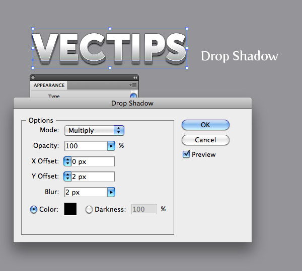
Step 8
With the four color stop gradient fill still selected in the
Appearance panel, go Effect > Stylize > Drop Shadow. In the Drop
Shadow dialog, change the Opacity to 100, the X Offset to 0, the Y
Offset to 2, and the Blur to 2. That is pretty much it!
Step 9
You can save the treatment as a Graphic Style to easily apply to
other type and vector objects. Simply select your text and press the New
Graphic Style button in the Graphic Style panel. Now press the new
graphic style with any object to apply the style. Pretty cool!

Final Image
At this point you can make the treatment better by jazzing up the
background with some grain textures and simple offsets to other text.
http://vectips.com/tutorials/create-a-polished-raised-type-treatment/
If you have read some of my other type tutorials, you
know I love the Appearance panel. This tutorial is no different. Using
the Appearance panel, some gradients, and transforms, you can create a
polished lifted type treatment. Using the Appearance panel makes it
super easy to apply the treatment to other fonts and vector elements.
Final Image
Below is the final type treatment we will be working towards.
Tutorial Details
- Program : Adobe Illustrator CS5
- Difficulty: Intermediate
- Topics Covered: Appearance Panel
- Estimated Completion Time: 15-20 minutes
Step 1
In a new document, use the Rectangle tool (M) to create a rectangle
the size of your document and fill it with a gray color. Having a
background color from the beginning will make it easier to see the
changes we will be making to the text.
Step 2
With the Type tool (T), type out some text. Mine is around 100pt for
big header text, but you can adjust the text to fit your needs. Next,
remove any fill and stroke from the text, we will be directly adjusting
these in the Appearance panel.
Step 3
With the text selected, choose Add New Fill from the pop-up menu of
the Appearance panel. Change the new fill to a linear gradient with the
first color stop white and the second a light gray. From the Gradient
panel change the Location of the first white color stop to 40 and change
the Angle to -90.
Step 4
From the Appearance panel, create a new fill like in the previous
step, fill it with white, and make sure the white fill is below the
first gradient in the Appearance panel. Select the white fill in the
list and go Effect > Path > Offset Path. In the Offset Path dialog
change the Offset to 1 px. With the white fill still selected in the
Appearance panel list, go Effect > Distort & Transform >
Transform. In the Transform Effect dialog, change the Vertical Move to 1
px.
Step 5
From the Appearance panel, select the white fill, and press the
Duplicate Selected Item button at the bottom of the panel. Select the
bottom copy and fill it black. Expand the attributes on the fill by
pressing the small arrow to the left of the fill thumbnail if it is not
expanded already. Click on Transform to open the Transform Effect dialog
and change the Vertical Move to 2 px.
Step 6
Duplicate the black fill like in the previous step and change the
fill to a linear gradient. Add two more color stops to the linear
gradient and change the first to black, the second to a dark gray, the
second to a slightly lighter gray than the second, and the fourth to a
gray slightly darker than the second. Next, change the Angle to -90.
Step 7
Expand the attributes of the new linear gradient in the Appearance
panel, and click on the Transform Effect. With the Transform Effect
dialog open, change the number of Copies to 10 and the Vertical Move to 1
px.
Step 8
With the four color stop gradient fill still selected in the
Appearance panel, go Effect > Stylize > Drop Shadow. In the Drop
Shadow dialog, change the Opacity to 100, the X Offset to 0, the Y
Offset to 2, and the Blur to 2. That is pretty much it!
Step 9
You can save the treatment as a Graphic Style to easily apply to
other type and vector objects. Simply select your text and press the New
Graphic Style button in the Graphic Style panel. Now press the new
graphic style with any object to apply the style. Pretty cool!
Final Image
At this point you can make the treatment better by jazzing up the
background with some grain textures and simple offsets to other text.
http://vectips.com/tutorials/create-a-polished-raised-type-treatment/

discovery- الجنس :

عدد المساهمات : 1005
النقاط : 54302
التقييم : 12
تاريخ التسجيل : 2010-04-28
» Create a Grimy Text Treatment with a Pen Tablet
» Illustrator’s Type Tool: A Comprehensive Introduction
» Movie type Explosions Photoshop Tutorial
» Discover What Type of Designer Are You?
» Create An Animated Gif Banner
» Illustrator’s Type Tool: A Comprehensive Introduction
» Movie type Explosions Photoshop Tutorial
» Discover What Type of Designer Are You?
» Create An Animated Gif Banner
Page 1 of 1
Permissions in this forum:
You cannot reply to topics in this forum|
|
|