 Search
Things You Can’t Forget When Designing a Blog
Page 1 of 1

Things You Can’t Forget When Designing a Blog
![]() by 3loomi Fri Nov 12, 2010 1:52 am
by 3loomi Fri Nov 12, 2010 1:52 am
9 Things You Can’t Forget When Designing a Blog
Things You Can’t Forget When Designing a Blog
Designing a blog can be quite a daunting task, tobe sure. To-do lists alone could fill pages if you were to include allthe minor details that accompany the project. Which is why mostdesigners shy away from logging that in-depth of a laundry list ofitems, indispensable and not so much, to get done by the launch date ofthe blog. Which is also why some of these little things that would makethe latter pages of the list, more often than not, get overlooked. Never fear, that is why we are here!Itis an easy thing to do when so much is on your plate, to let one or twoof the smaller details silently slip through the cracks, remaininghidden in the dark crevasses in the backs of our minds. And though thischecklist may not be as long as I exaggerated such a comprehensiveto-do list would be, this is a list of nine very important details thatmany blog designers overlook. These are often thought of as so minorthat it makes little to no difference in the overall design of yourblog. However, these features can serve to top things off, design wise,and act as some simple finishing touches that step up your blog’spresentation, and thereby, its presence.1. Favicon
Howimportant can a tiny 16×16 pixel square be? Well, I guess the trueanswer to that, would be relatively based on how important yourbranding is to you. Favicons not only take your branding a step furtherin solidifying it, but they also make for easily recognizable bookmarksfor your readers. And any steps that you can take to improve yourreader’s experience is always a worthwhile time investment that willpay off in the end. It may be one small step for you, but it will beone giant leap for your blog.Resources
It’s very simple to add a favicon to your website.Step 1 – Create the favicon and name it favicon.ico. Below are a couple of resources to help you.
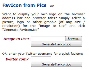
Favicon from PicsQuickly create favicons from images or
your Twitter icon.

How to Create a Favicon in PhotoshopA tutorial on how to create a favicon in Photoshop and save it as an .ico file.Step 2 – Upload favicon.ico to your root directoryStep 3 – Add the following line of code between the head tags of your header file.view plaincopy to clipboardprint?
Inspiration
Favicons Episode 8– Smashing Magazine has an 8 part series featuring some of the bestfavicons from around the web. The other 7 parts are also listed in thepost.2. Subtle use of gradients, textures, shadows & single pixel lines
…Ohmy! That is a bit of a list in and of itself, but it is better seen asa number of available options at the blog designer’s disposal toenhance their work. These small details give a design depth and keepthings from looking flat and boring. You want your design to bepleasing to the eye, to appeal to your readers and entice new ones tocheck out your site. If the site looks dull and drab, then more timesthan not, people may judge the content and bloggers to be the same.Make the right first impression through your design with these subtleinclusions, and you will not be sorry that you took the extra time.Resources

How To Make Your Next Website Design PopLoads of great tips on those subtle visuals that will polish your
design.
A Gradient TutorialSome great tips on the proper use of gradients and some common problems new designers
have.

Texture LoversA large collection of textures from around the web that are free for commercial use.

Lost & TakenA blog dedicated to providing high quality free textures to the design community.Inspiration

justBcoz

Lyndsey Hamilton Events

The Perfect Bite Co.
3. Icons
Comingin third on the list (though to be fair, they are not listed in anykind of order of importance, because they are all important), focuseson you finding or making the right set of icons to fluidly fit intoyour design. There are literally thousands of icon sets that have beengraciously given to the community, so give this search the time itneeds to be thorough. Or again, create a set of custom icons tocomplement your theme. You want these elements to mix seamlessly withyour site, so as to not detract from your flow and design. Also makesure to use link icons to let people know what kind of link they arefollowing. Again, this is just a matter of courtesy to your readers.Resources
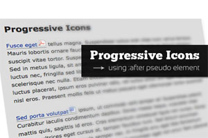
Add Progressive Icons to Your Site Using :after pseudo-elementA tutorial that teaches you how to add icons to
the links on your site
.
How To Use Icons To Support Content In Web DesignA great and in depth tutorial on how you can use icons to enhance your web designs.

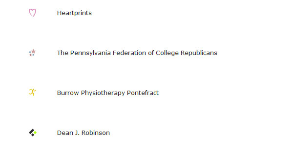
Icon FinderAn icon search engine including over 100k icons and 186 icon sets.

75 Free Useful Icon Sets for Web Designers and DevelopersA varied collection of both free and premium icon sets.Inspiration
Line 25

Inspired Magazine

Colorburned
4. Whitespace
Thisis one I have had to struggle with myself, but you can learn from myshortcomings without succumbing to them yourself. Do not fall into thesame trap I fell into, feeling that just because you have empty spaceit has to be filled with something, anything…it didn’t matter if itserved the design or not, the whitespace had to go. Through growing asa designer, and strict bi-weekly aversion therapy sessions, I was ableto break free from my bad design stranglehold and see the light.Keeping whitespace makes your blog look clean and not overly cluttered,not to mention it really aids in making the content stand out.Resources

WhitespaceA List Apart’s look at the importance of using whitespace in web design.

Using White Space Effectively In Web DesignA how to on effectively using white space complete with some excellent examples.Inspiration

SW Graphic

Grow Collective

The Creative District
5. Alignment
Iunderstand that out of the box thinking which often leads to a lot ofinnovative design techniques, so I do not want to cramp anyone’s style,or more so their alignment, with this next topic. Alignment can be veryimportant for your site, simply because of the symmetrical feel andflow it can provide to your design. It is a scientifically arguedpoint, that people respond favorably to symmetry and through use of agrid, you can ensure that your elements are all in line, so to speak,and are visually stimulating to a majority of the masses who will beinteracting with your blog. By all means, buck the system if you want,but my advice would be to use a grid for initially laying out your blogdesign then, if necessary, break the grid.Resources

The Grid SystemThe ultimate resource in grid systems.

960 Grid SystemThe official site of the 960 grid system. Downloadtemplates and the CSS framework here.

Grid Based Design ToolboxPretty much any link you could think of on grid based designs.Inspiration

MDX Interactive

A Brief Message

Department of Spanish and Portuguese, UC Berkeley
6. Typography
Whatis a blog without words? Other than a non-descriptive gallery with nocontext, protext, or any kind of text. Kidding, but seriously, makingsure that the typography you have chosen for your blog is eye catching,is definitely one to consider, that some designers overlook. Like withmost media, your headlines have to stand out and grab reader’sattention to draw them in. A blog is no different. You may think thatwhat it says is all you need worry with, but you would be wrong. Makingsure that the fonts used are clear and readable are beyond a must, theyare…something that is beyond a must. If either your headlines or yourbody type are not clear, people are not going to stick around longtrying to decipher your typography.Resources

10 Web Typography Rules Every Designer Should KnowThe title says it all!

A Guide To Web TypographyI Love Typography’s guide discussing contrast, size, hierarchy and space.
6 Ways To Improve Your Web TypographyA must read article for anyone who wants to improve their web typography.Inspiration

FontShop

design|snips

Coudal Partners
7. Emphasis
Thisis another area where I know better than I perform, but I am working onit, and that is placing emphasis throughout the posts and site to makethe blog a bit more user friendly as well. With so much going on inyour posts and your blog, it is easy for a reader to becomeoverwhelmed, or simply not have the time to fully concentrate, and sothe user merely skims them both looking for something to catch theireye. Make sure that you take this into consideration and bold importantinformation for users to make it stand out for them. Also, be sure tohave your links highlighted in a complimentary color to make sure theydo not get overlooked by the busy reader, as well. Once again, it isalways beneficial to your blog to take the extra steps that improve theusers overall experience, and this is one of them.Resources

Emphasis in Web Design:
How to Make Things Stand OutA look at all the different elements you can use to add emphasis to your design.

Web Style Guide 3rd edition: EmphasisAn article specifically focusing on how to add emphasis to your typography.Inspiration

Nesta

Dead Metropolis

Narfstuff
8. Styling Lists & Blockquotes
Oneof the main focuses of your blog will be the posts you put up, so makesure you do not undercut your site by under-styling your content. Youwant to demonstrate pride in your work as you present it to youraudience, and one way to easily achieve this is through yourstyle-sheet. Having well styled lists and blockquotes can do a lot tonot only enhance the look of your posts, but if you have guest authorsit opens up the format for their posts a bit. Having a limitedstyle-sheet may effectively tie the hands of your guest writers who donot like having their posts presentation seeming bland andunsophisticated. So they opt to leave out elements that would normallygive the post a bit more presentational punch and pizazz.Resources
CSS Design: Taming ListsA tutorial that teaches you how to style lists in pretty much any way you can
imagine.

ListamaticListamaticshows the power of CSS when applied to one simple list. A greatresource if you quickly need to figure out how to do a particlular liststyle.

Six Ways To Style BlockquotesSix different ways to style blockquotes including how-tos for each.

Simple Double QuotesHow to style blockquotes using background images.Inspiration
Fuel Your Writing
I Love Colors

Web Design Ledger
9. Separate Comments from Trackbacks
Thefinal design detail that tends to get underestimated or under-valuedthat I want to talk about here, is the separation of comments from thearticle’s trackbacks. While it is understandable for you to want to notonly recognize those who link to your work, but also to keep thoselinks in the post for prominence and relevance, you have to keep inmind that it can be frustrating for a reader to have to sift throughtrackbacks mixed in with comments. Taking the time to distill the twoelements apart from each other on your blog will help with the flow ofreadability, and once more show a dedication to the user friendlinessof your site. As I said, it is nice to want to include these linkskindly extended to your work, but that is generally not what thereaders who comb through your comments are looking to read.Resources

Separating Trackbacks from CommentsAn extremely
simple how-to
.
Separating and Hiding Trackbacks with Jquery in WordPress 2.7Useful if you want to either separate or hide trackbacks.Inspiration

Fudge Graphics

Mac AppStore

Pattern Head
That’ll do it from this end
Wellthose are my nine suggested details that you need to keep a focus fixedon as you dive into your blog design so that they do not get left onthe road of good intentions. What other major ‘minors’ do you hate tosee forgotten?
:@:
Things You Can’t Forget When Designing a Blog
Designing a blog can be quite a daunting task, tobe sure. To-do lists alone could fill pages if you were to include allthe minor details that accompany the project. Which is why mostdesigners shy away from logging that in-depth of a laundry list ofitems, indispensable and not so much, to get done by the launch date ofthe blog. Which is also why some of these little things that would makethe latter pages of the list, more often than not, get overlooked. Never fear, that is why we are here!Itis an easy thing to do when so much is on your plate, to let one or twoof the smaller details silently slip through the cracks, remaininghidden in the dark crevasses in the backs of our minds. And though thischecklist may not be as long as I exaggerated such a comprehensiveto-do list would be, this is a list of nine very important details thatmany blog designers overlook. These are often thought of as so minorthat it makes little to no difference in the overall design of yourblog. However, these features can serve to top things off, design wise,and act as some simple finishing touches that step up your blog’spresentation, and thereby, its presence.1. Favicon
Howimportant can a tiny 16×16 pixel square be? Well, I guess the trueanswer to that, would be relatively based on how important yourbranding is to you. Favicons not only take your branding a step furtherin solidifying it, but they also make for easily recognizable bookmarksfor your readers. And any steps that you can take to improve yourreader’s experience is always a worthwhile time investment that willpay off in the end. It may be one small step for you, but it will beone giant leap for your blog.Resources
It’s very simple to add a favicon to your website.Step 1 – Create the favicon and name it favicon.ico. Below are a couple of resources to help you.
Favicon from PicsQuickly create favicons from images or
your Twitter icon.
How to Create a Favicon in PhotoshopA tutorial on how to create a favicon in Photoshop and save it as an .ico file.Step 2 – Upload favicon.ico to your root directoryStep 3 – Add the following line of code between the head tags of your header file.view plaincopy to clipboardprint?
Inspiration
Favicons Episode 8– Smashing Magazine has an 8 part series featuring some of the bestfavicons from around the web. The other 7 parts are also listed in thepost.2. Subtle use of gradients, textures, shadows & single pixel lines
…Ohmy! That is a bit of a list in and of itself, but it is better seen asa number of available options at the blog designer’s disposal toenhance their work. These small details give a design depth and keepthings from looking flat and boring. You want your design to bepleasing to the eye, to appeal to your readers and entice new ones tocheck out your site. If the site looks dull and drab, then more timesthan not, people may judge the content and bloggers to be the same.Make the right first impression through your design with these subtleinclusions, and you will not be sorry that you took the extra time.Resources
How To Make Your Next Website Design PopLoads of great tips on those subtle visuals that will polish your
design.
A Gradient TutorialSome great tips on the proper use of gradients and some common problems new designers
have.
Texture LoversA large collection of textures from around the web that are free for commercial use.
Lost & TakenA blog dedicated to providing high quality free textures to the design community.Inspiration
justBcoz
Lyndsey Hamilton Events
The Perfect Bite Co.
3. Icons
Comingin third on the list (though to be fair, they are not listed in anykind of order of importance, because they are all important), focuseson you finding or making the right set of icons to fluidly fit intoyour design. There are literally thousands of icon sets that have beengraciously given to the community, so give this search the time itneeds to be thorough. Or again, create a set of custom icons tocomplement your theme. You want these elements to mix seamlessly withyour site, so as to not detract from your flow and design. Also makesure to use link icons to let people know what kind of link they arefollowing. Again, this is just a matter of courtesy to your readers.Resources
Add Progressive Icons to Your Site Using :after pseudo-elementA tutorial that teaches you how to add icons to
the links on your site
.
How To Use Icons To Support Content In Web DesignA great and in depth tutorial on how you can use icons to enhance your web designs.
Icon FinderAn icon search engine including over 100k icons and 186 icon sets.
75 Free Useful Icon Sets for Web Designers and DevelopersA varied collection of both free and premium icon sets.Inspiration
Line 25
Inspired Magazine
Colorburned
4. Whitespace
Thisis one I have had to struggle with myself, but you can learn from myshortcomings without succumbing to them yourself. Do not fall into thesame trap I fell into, feeling that just because you have empty spaceit has to be filled with something, anything…it didn’t matter if itserved the design or not, the whitespace had to go. Through growing asa designer, and strict bi-weekly aversion therapy sessions, I was ableto break free from my bad design stranglehold and see the light.Keeping whitespace makes your blog look clean and not overly cluttered,not to mention it really aids in making the content stand out.Resources
WhitespaceA List Apart’s look at the importance of using whitespace in web design.
Using White Space Effectively In Web DesignA how to on effectively using white space complete with some excellent examples.Inspiration
SW Graphic
Grow Collective
The Creative District
5. Alignment
Iunderstand that out of the box thinking which often leads to a lot ofinnovative design techniques, so I do not want to cramp anyone’s style,or more so their alignment, with this next topic. Alignment can be veryimportant for your site, simply because of the symmetrical feel andflow it can provide to your design. It is a scientifically arguedpoint, that people respond favorably to symmetry and through use of agrid, you can ensure that your elements are all in line, so to speak,and are visually stimulating to a majority of the masses who will beinteracting with your blog. By all means, buck the system if you want,but my advice would be to use a grid for initially laying out your blogdesign then, if necessary, break the grid.Resources
The Grid SystemThe ultimate resource in grid systems.
960 Grid SystemThe official site of the 960 grid system. Downloadtemplates and the CSS framework here.
Grid Based Design ToolboxPretty much any link you could think of on grid based designs.Inspiration
MDX Interactive
A Brief Message
Department of Spanish and Portuguese, UC Berkeley
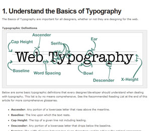
6. Typography
Whatis a blog without words? Other than a non-descriptive gallery with nocontext, protext, or any kind of text. Kidding, but seriously, makingsure that the typography you have chosen for your blog is eye catching,is definitely one to consider, that some designers overlook. Like withmost media, your headlines have to stand out and grab reader’sattention to draw them in. A blog is no different. You may think thatwhat it says is all you need worry with, but you would be wrong. Makingsure that the fonts used are clear and readable are beyond a must, theyare…something that is beyond a must. If either your headlines or yourbody type are not clear, people are not going to stick around longtrying to decipher your typography.Resources
10 Web Typography Rules Every Designer Should KnowThe title says it all!
A Guide To Web TypographyI Love Typography’s guide discussing contrast, size, hierarchy and space.
6 Ways To Improve Your Web TypographyA must read article for anyone who wants to improve their web typography.Inspiration
FontShop
design|snips
Coudal Partners
7. Emphasis
Thisis another area where I know better than I perform, but I am working onit, and that is placing emphasis throughout the posts and site to makethe blog a bit more user friendly as well. With so much going on inyour posts and your blog, it is easy for a reader to becomeoverwhelmed, or simply not have the time to fully concentrate, and sothe user merely skims them both looking for something to catch theireye. Make sure that you take this into consideration and bold importantinformation for users to make it stand out for them. Also, be sure tohave your links highlighted in a complimentary color to make sure theydo not get overlooked by the busy reader, as well. Once again, it isalways beneficial to your blog to take the extra steps that improve theusers overall experience, and this is one of them.Resources
Emphasis in Web Design:
How to Make Things Stand OutA look at all the different elements you can use to add emphasis to your design.
Web Style Guide 3rd edition: EmphasisAn article specifically focusing on how to add emphasis to your typography.Inspiration
Nesta
Dead Metropolis
Narfstuff
8. Styling Lists & Blockquotes
Oneof the main focuses of your blog will be the posts you put up, so makesure you do not undercut your site by under-styling your content. Youwant to demonstrate pride in your work as you present it to youraudience, and one way to easily achieve this is through yourstyle-sheet. Having well styled lists and blockquotes can do a lot tonot only enhance the look of your posts, but if you have guest authorsit opens up the format for their posts a bit. Having a limitedstyle-sheet may effectively tie the hands of your guest writers who donot like having their posts presentation seeming bland andunsophisticated. So they opt to leave out elements that would normallygive the post a bit more presentational punch and pizazz.Resources
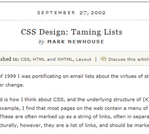
CSS Design: Taming ListsA tutorial that teaches you how to style lists in pretty much any way you can
imagine.
ListamaticListamaticshows the power of CSS when applied to one simple list. A greatresource if you quickly need to figure out how to do a particlular liststyle.
Six Ways To Style BlockquotesSix different ways to style blockquotes including how-tos for each.
Simple Double QuotesHow to style blockquotes using background images.Inspiration
Fuel Your Writing
I Love Colors
Web Design Ledger
9. Separate Comments from Trackbacks
Thefinal design detail that tends to get underestimated or under-valuedthat I want to talk about here, is the separation of comments from thearticle’s trackbacks. While it is understandable for you to want to notonly recognize those who link to your work, but also to keep thoselinks in the post for prominence and relevance, you have to keep inmind that it can be frustrating for a reader to have to sift throughtrackbacks mixed in with comments. Taking the time to distill the twoelements apart from each other on your blog will help with the flow ofreadability, and once more show a dedication to the user friendlinessof your site. As I said, it is nice to want to include these linkskindly extended to your work, but that is generally not what thereaders who comb through your comments are looking to read.Resources
Separating Trackbacks from CommentsAn extremely
simple how-to
.
Separating and Hiding Trackbacks with Jquery in WordPress 2.7Useful if you want to either separate or hide trackbacks.Inspiration
Fudge Graphics
Mac AppStore
Pattern Head
That’ll do it from this end
Wellthose are my nine suggested details that you need to keep a focus fixedon as you dive into your blog design so that they do not get left onthe road of good intentions. What other major ‘minors’ do you hate tosee forgotten?
:@:

3loomi- الجنس :

عدد المساهمات : 826
النقاط : 52449
التقييم : 10
تاريخ التسجيل : 2010-09-01
» t.A.T.u. - All The Things She Said
» 10 Things You Think Will Make You Happy – But Won't
» The Top 10 Secrets to Designing a Magazine
» Logo Designing Photoshop Tutorials
» Web Designing Services: Importance of W3C Standards
» 10 Things You Think Will Make You Happy – But Won't
» The Top 10 Secrets to Designing a Magazine
» Logo Designing Photoshop Tutorials
» Web Designing Services: Importance of W3C Standards
Page 1 of 1
Permissions in this forum:
You cannot reply to topics in this forum|
|
|